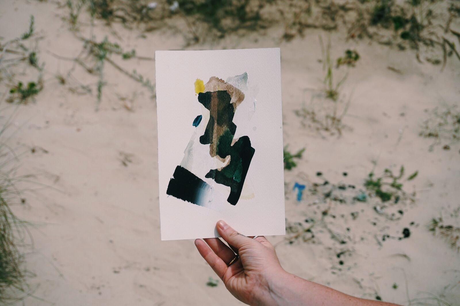
These pieces look at the tension that occurs between elements. They were heavily influenced by the experience of swimming in a kelp forest during the equinox in Co. Donegal. The eye is drawn to the distinct line across the canvas where colour and form are pushed against each other, as if from different vistas. Water and air pull together at the submerging horizon. The use of negative space adds to a sense of blurring between plains. Quick-blended brushstrokes in oil capture the feeling of dancing fractures where light succeeds and fails to permeate.
Read MoreRIALAIG SERIES - NEW WORKS
I’m delighted to share a series of work I created back in January before the world tipped upside down. I spent 10 days at Cill Rialaig near the small town of Ballinskelligs. The weather shifted into torrential downpour and howling winds more than once, and the very short days meant that working late into the evening in front of the fire became a daily ritual. This series was funded through the sale of my ’Kerry Encounters’ colour postcards, so for those of you who purchased a postcard and supported the residency, Thanks a mill!

Veils Across The Blue
€160.00
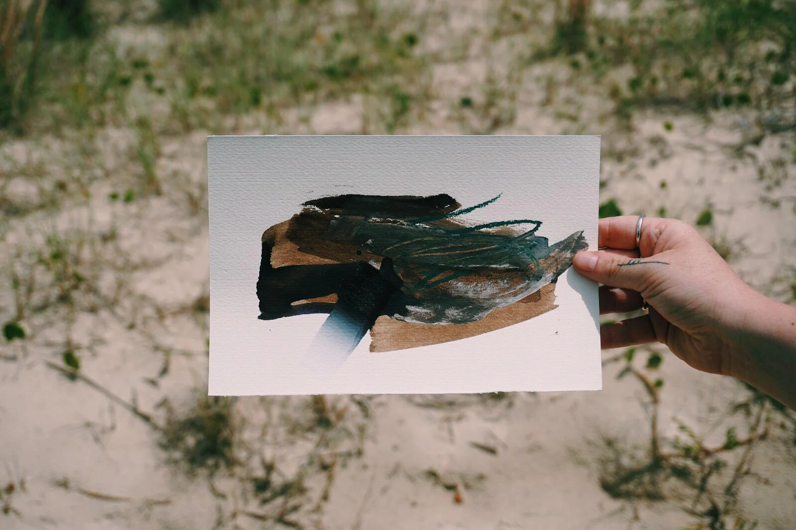
I characterise my paintings as gestural and experimental, with a strong emphasis on capturing the essence of specific elements of the landscape. In the case of these monoprints, my mark-making was heavily influenced by how the changing skies over the atlantic during the winter months shape the relationship between water and air. They respond to the site of Bolus Head, looking across the ocean towards The Skelligs, in West Kerry.


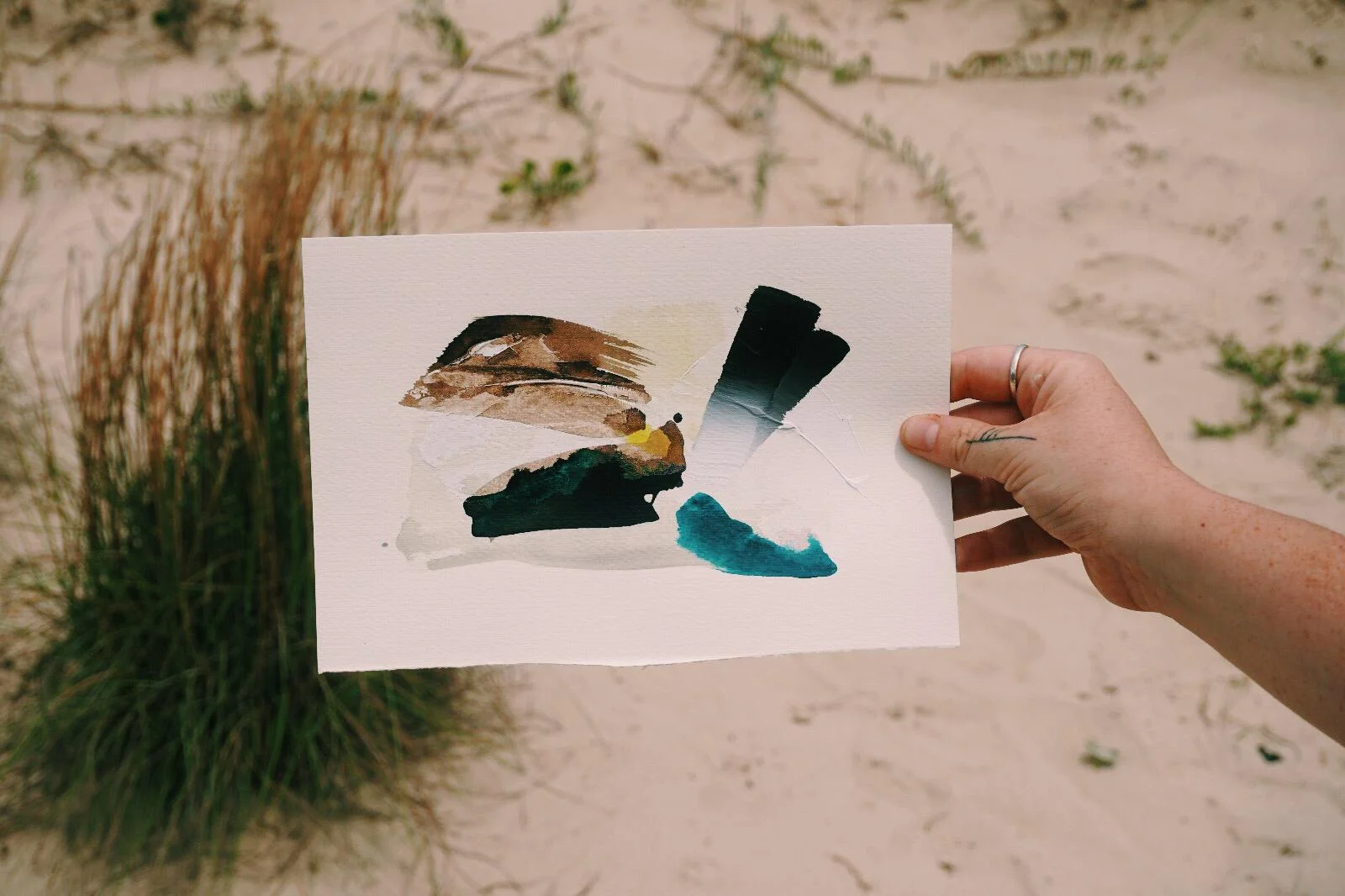
Tumultous Horizon
Sale Price:
€110.00
Original Price:
€220.00
The imagery is not grounded in representation, but rather a reimagining of the atmosphere of a site. The works depict a blending of sea and sky, where the horizon line moves in and out of focus. The wind blown clouds quickly shift, opening bright for short moments, then veiling the scape once again. There is an urgency in the clouds depicted through haphazard mark making and an evocation of West Kerry’s battering storms.My hand is heavy but the application of ink is fluid, leaving behind traces of my process through scraping, scouring and pushing colour across the plate. The works create a balance between elements, rain and sea, clouds and wind, often with one reflecting the movement of the other.
I used Akua inks, which have a tendency towards a more milky appearance, to further point to the haziness of the vistas. While in residency at Bolus Head I created bio colour inks from materials I gathered on site. Charred Oak (from the stove in my old stone cottage, and my main source of heat) has been mixed with the Akua Ink and applied to the second plate of the monoprints. The contrast of the charcoal adds to the sense of chaos of skies.

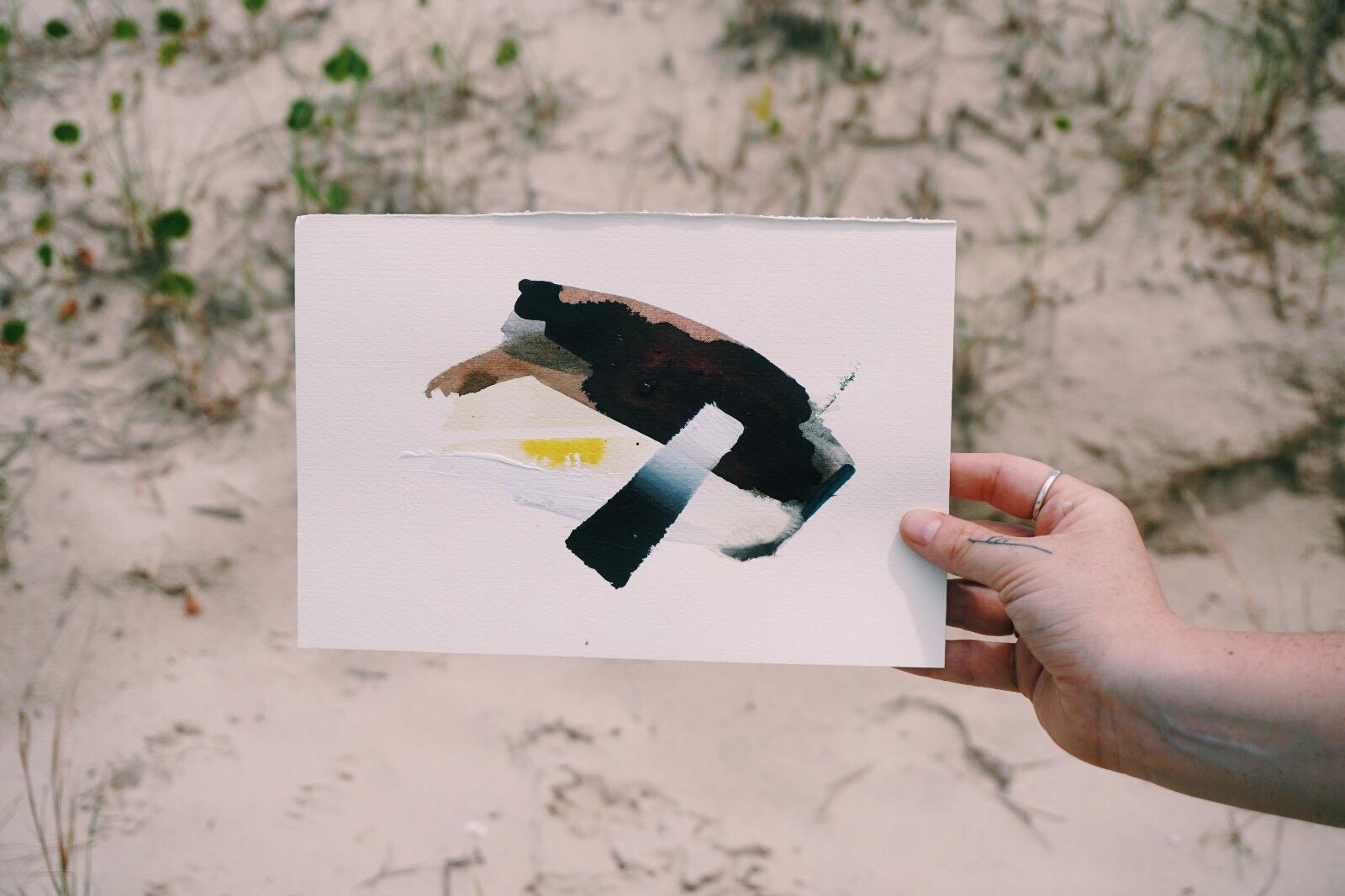
With Water Dark And Glowing
€160.00
The titles are inspired by “Ten Poems about Clouds”, selected by Katharine Towers. A beautiful compilation of poems that could be described as a ‘cloud appreciation book’. It is available through candlestick press.co.uk and features the work of Liz Berry, Billy Collins, John Glenday, Paul Mehan, Fiona Sampson, Leslie Saunders, Katherine Towers, Sarah Westcott and Derek Walcott. Other titles are from Robert Frost’s ‘A Line-Storm Song’ and Emily Dickinson’s ‘The Sky Is Low’.
All pieces are available unframed as delivery increases significantly on framed work, but if you would like to chat about framing, please let me know and we can work something out. I’m also happy to share my two cents on framing options for the works, even if you frame them closer to home.
Kari x

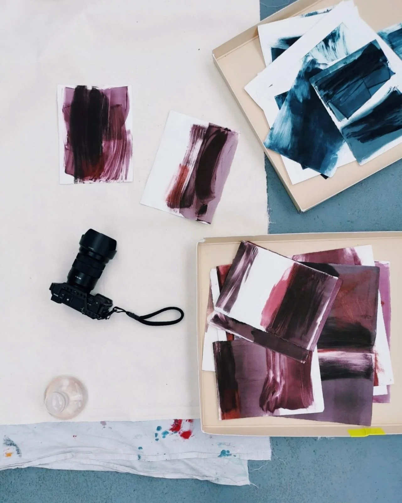
Arboreal Bind - New Works
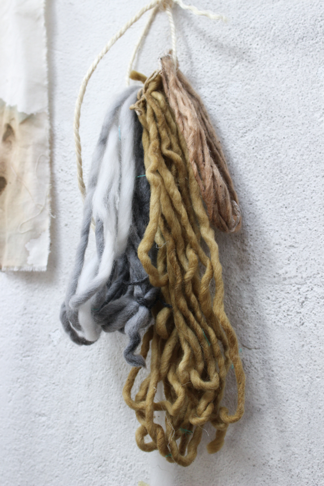
For this series I focussed my colour pallet on hues and tones created primarily from Oak. As the pieces developed I added Walnut bio colour for it’s deep brown shade, which set off the lighter golden hues of the Oak Gall Ink.
I used oak in various forms; charred bark which resulted in charcoal black as, well as the ash from an oak fire which gave me pale cream chalk. The mid-tones were created using oak gall ink. Each ingredient had fulfilled it’s environmental role, discarded and burnt. Through the process of colour making I was able to prolong the life-span of these arboreal materials.
I employed the use of broad brush strokes that appear to continue past the parameter of the page. The colours pooled on the surface of the paper, melding and infusing together, as if alive. As the paint dried, this blending of organic matter was captured.

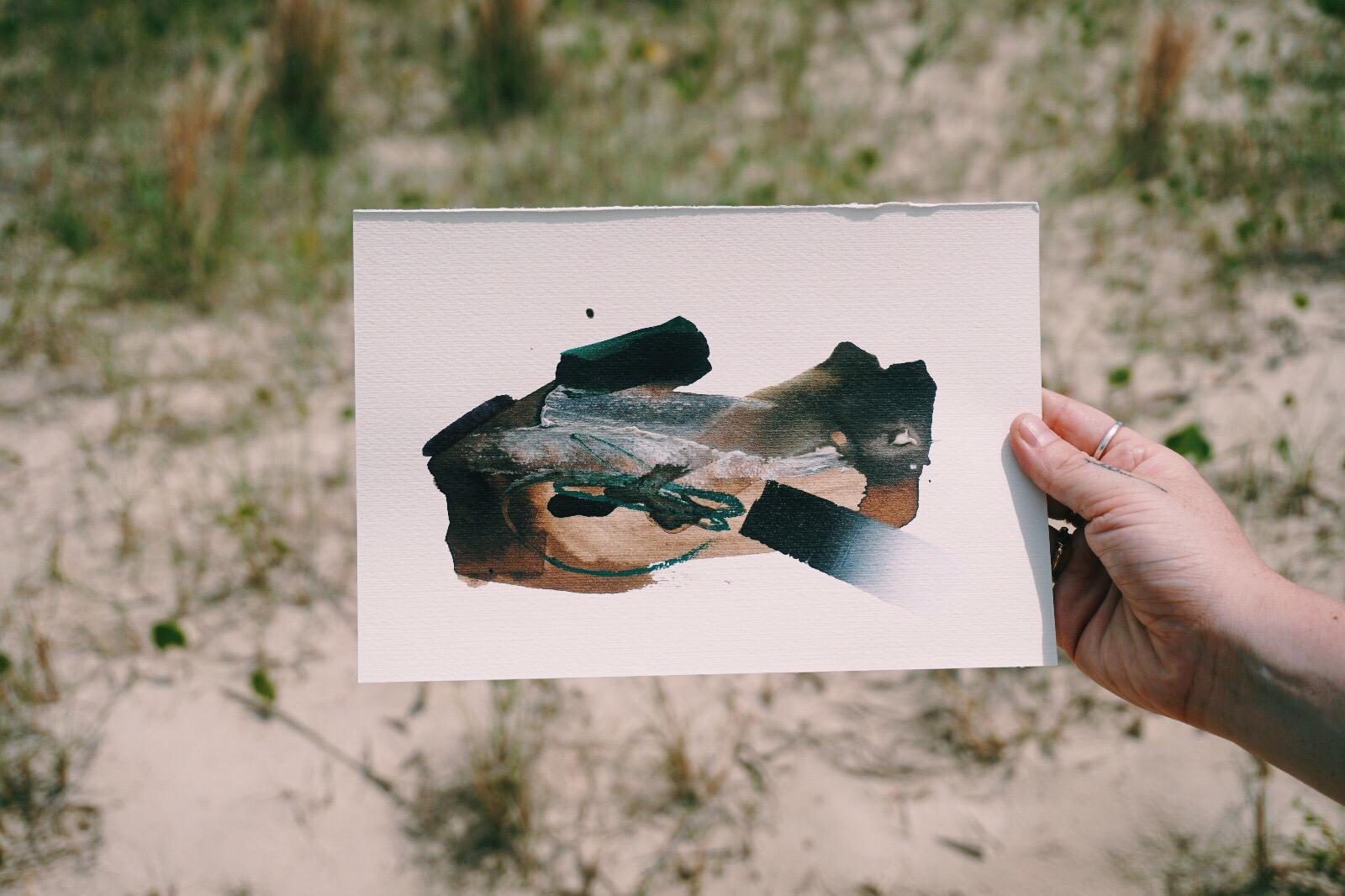
Of Wind Blown Husks
€380.00

Fissure Glitter
€190.00
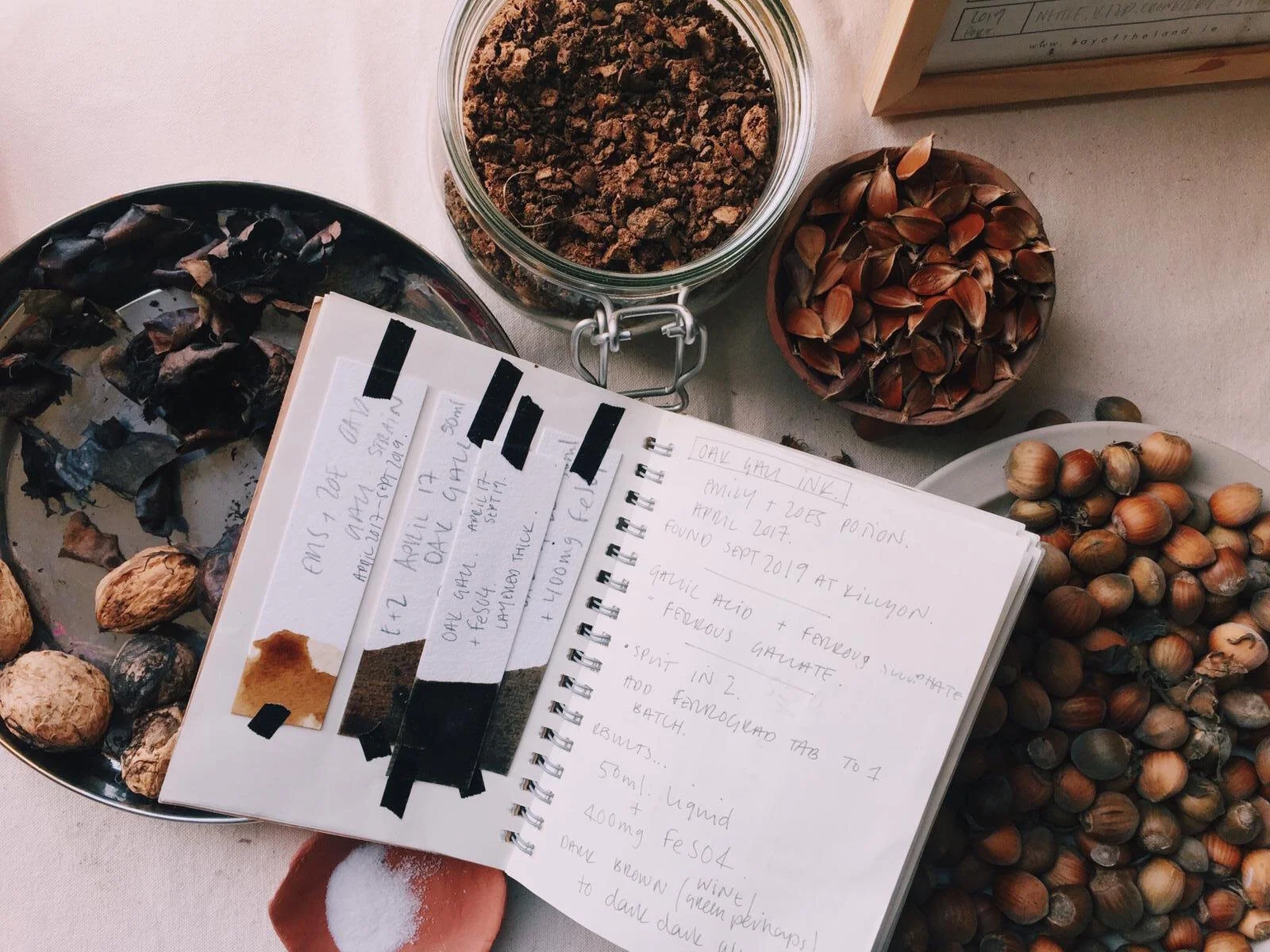
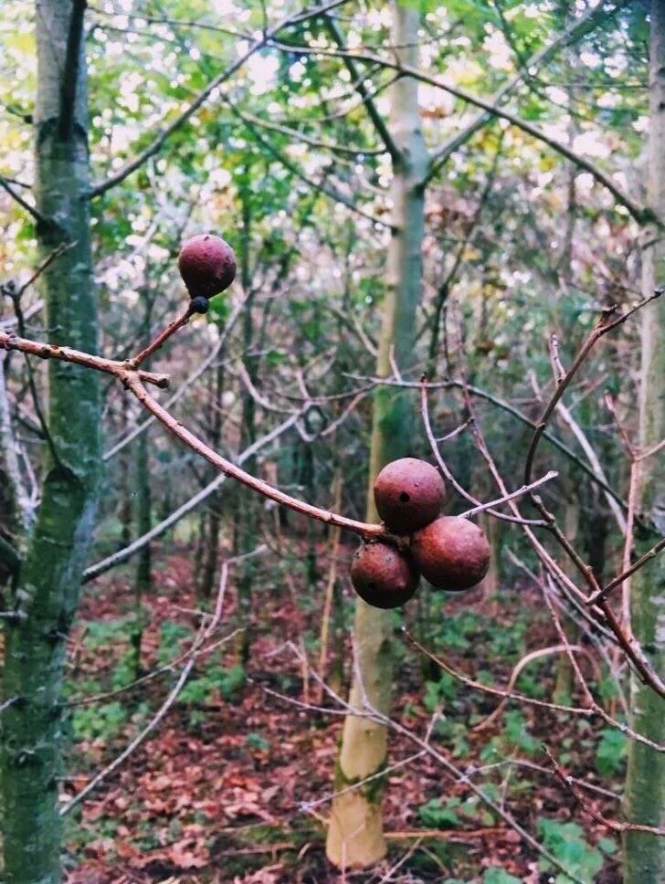
Oak galls ink is one of my favourte to make - the galls are formed when a wasp lays its eggs on the branch of an oak sapling. The tree responds to the wasp larvae by creating a protective orb or “gall” around the wasp babies. Eventually, the wasp bores a tiny, perfectly circular, tunnel out of the gall and flies off, leaving its gall haven behind. I collect the galls from the low lying branches of young oak trees. (If you ever come across galls in abundance please let me know)
I crush and soak the galls for between 3 weeks and a year depending on how rich I would like the colour. After straining the liquid, I add FeS04 (Liquid Iron) which reacts with the tannic acid to turn the ink from golden brown to black/green brown. After brushing the ink on the page the ink deepens through oxidization, further appearing as a rich, indelible black.
Oak Gall is the quintessential calligrapher’s ink and has been used since the middle ages. the Book of Kells contains oak gall ink, and until recent technology took over, oak gall was the official registrar’s ink for signing legal documents.

Silk & Subterranea
€380.00
The full series can be viewed through my online store. If you have any questions please get in touch.
Tabhair Aire
Kari x
Red Canopy X ALS
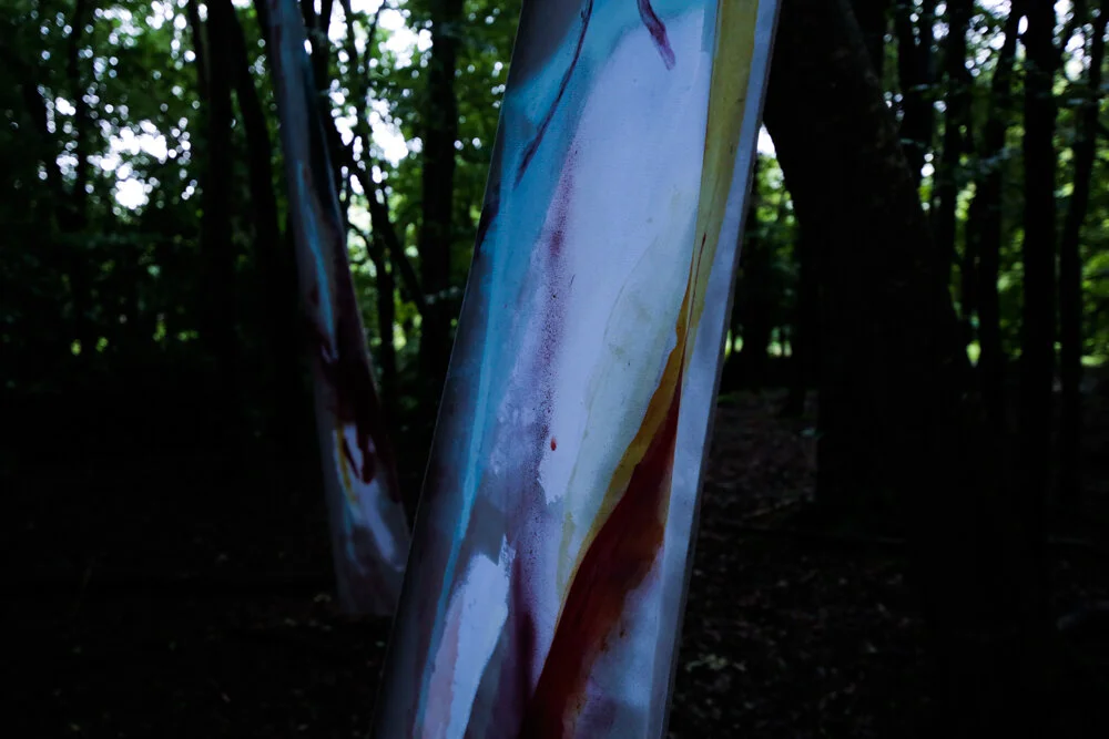
August, for me, always means Another Love Story. The most precious festival out there in a place that means so much to me. Killyon Manor hosts ALS every year on their vast grounds, and it’s exciting to watch the ALS crew pull together such a wonderfully engaging and thoughtful festival during the lead up to the weekend. Killyon was where I called home for the Winter 2017 into 2018 and the ground, as well as being one of the best spots for foraging for blackberries, walnut, oak galls, birch bark and elderberries, always ignites a feeling of home for me. This ALS I was given the opportunity to install ‘Red Canopy’ in the forest.

Immeditately the red hues of the pieces drew out the red tones of the soil. The twisting roots and branches of the trees are echoed in the painted strokes, constantly moving upward towards the forest canopy. I use gestural movements to react to spaces. I pour, drip, scrape, blush and bruise colour onto the surface of my paintings. Layering textures becomes a way to investigate the relationship between hues and tones. Colours emerge directly from the environment dictating the palette I work with. Colour asks to be seen. The simple application of colour to a surface is nuanced, bridges the gap in our relationship to the environments we inhabit.


The audience moved through the installation guided by their curiosity to keep discovering colours through the disruption of painted surfaces. They were invited to come closer and move around to enjoy the negative space between the trees and the works.

This was the first time I’ve had a chance to light the paintings, and Jerry came up with a subtle was to point LED spots at the works, embedding the wires and bulbs in dead branches laying on the forest floor. Although incredibly hard to photograph, the piece came alive at dusk, when the light only barely made it through the trees and the deep brown trunks and soil appeared almost black.

Massive thanks to the ALS Crew, Fellipe Lopes, Steve O’Connor, Zoe Purcell & Jerry for helpign me pull this one off.
To see more work like this, and to follow my colour exploration you can join my Colour Newsletter. Each month will focus on a particular shade and I’ll share my findings, recipes for making, and uses by myself and other artists I admire.
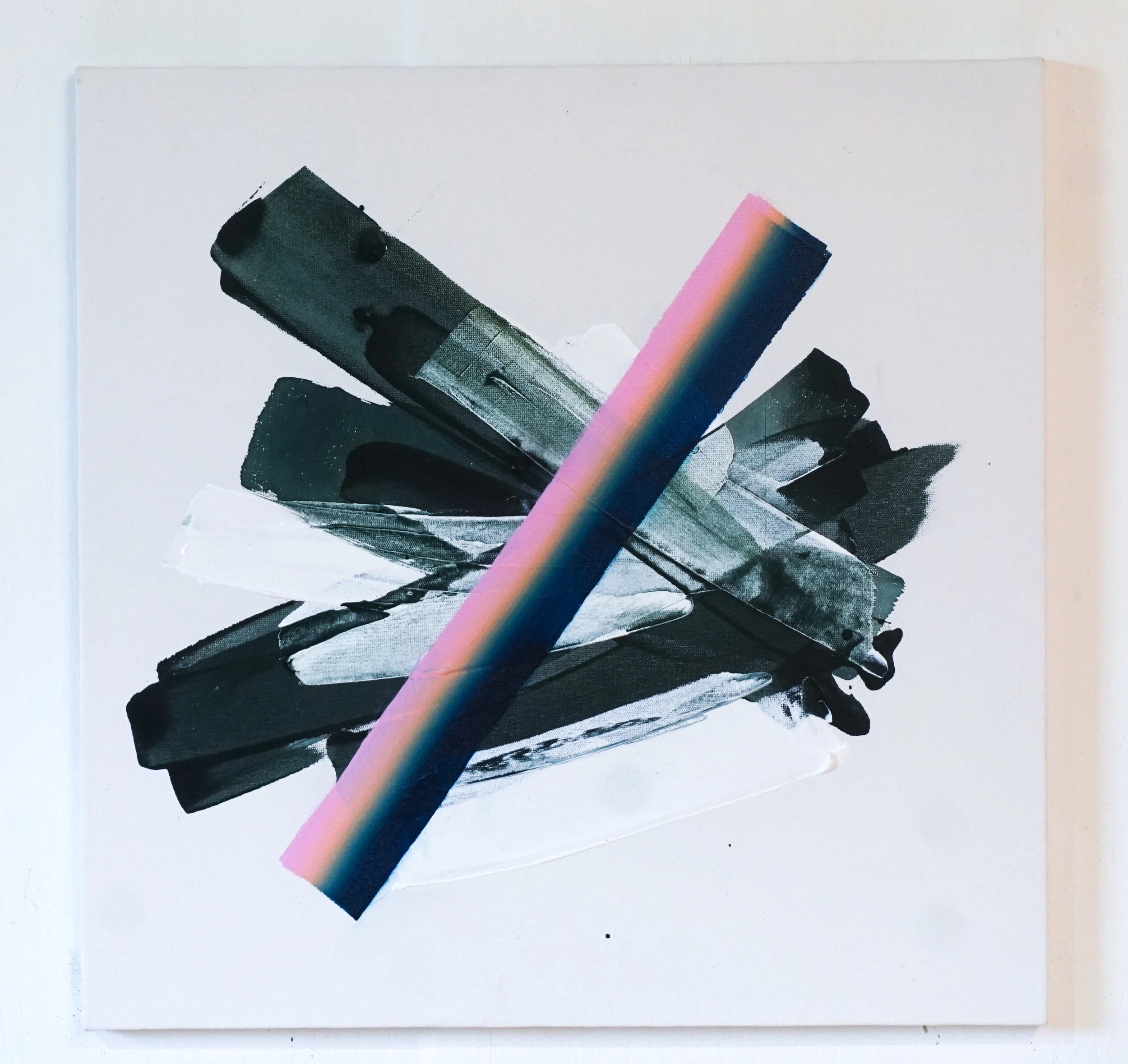
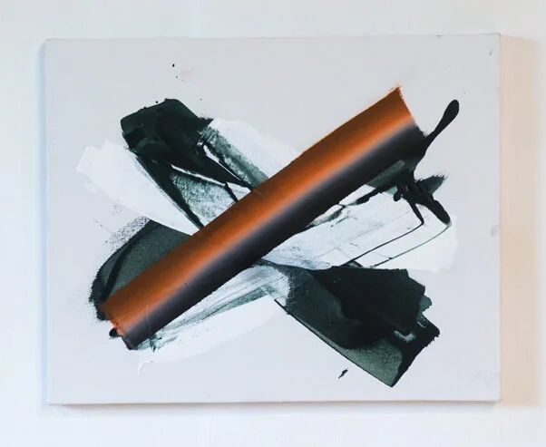
Spectrum Series
Delicious strokes of colour flat against a textured background. There is something delicious about the way the colour fuses together. Being summertime the light hits the land straight in, striking light through the trees and creating dense shadows. Bright sparky colours bounce through the vistas.
In Sligo, I was given a chance to create a series of works on canvas. I approached this as an exercise in exploring a technique. I wanted to fully engage in the process of applying three distinct layers in various colour combinations. The works are made up of three components; the white texture background, followed by the messy spirited splash, and finally the slow strong gradient stroke. The slow steady application of the stoke, after the uninhibited gestural splash forces me to shift my thinking, and my hand-eye co-ordination. Each component is intuitive - moving between complete abandon and frenzied focus.
Spectrum. Green. Lime/Fuschia
Sure it’s that time of year again when days roll together and time seems to flit past in an instant. The hours spent in deep concentration working on these pieces will mark the presence of being in Sligo at this moment.
All the works are available for purchase - see my Instagram & Artwork Archive for more deeeeets.


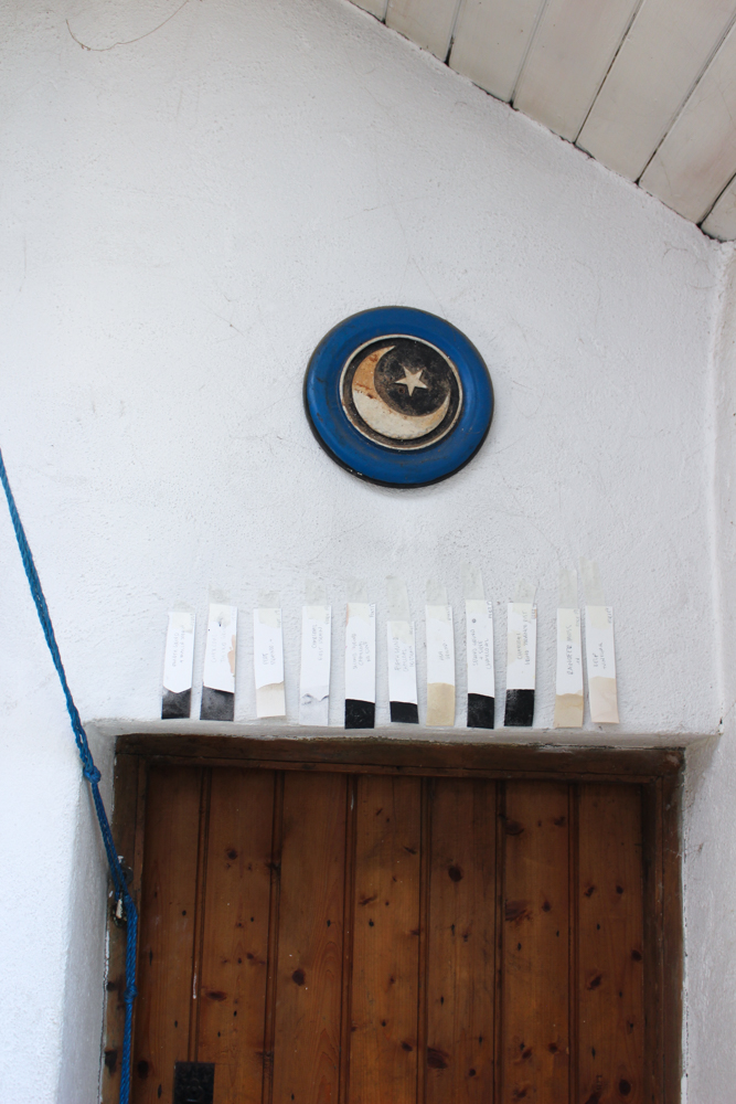
Port Inks - An exploration
Cloud footed findings,
Harboured in slumbering sludge,
reveals alchemy.
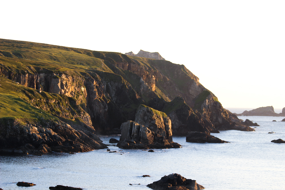
Port, Donegal. Lay of the Land Residency. 2019.
For two weeks we rooted down in Port, Donegal. The off grid stone cottage was the backdrop to our investgations into the landscape. Immersing ourselves in the flora, fauna and bogland for a fortnight gave space to the beginnings of an exporation that I believe has sparked a limitless direction.

Starting out I had no idea what to expect from the roots, leaves, and shoots of plants. I gathered rust and stones in hopes of pigment and hues. I ground charcoal and ash from the well used fireplace, and foraged from the shores of the harbour. The experiments were a catayst for conversations around colour theory and nature based creativity, with close attention paid to the processes we were undertaking.
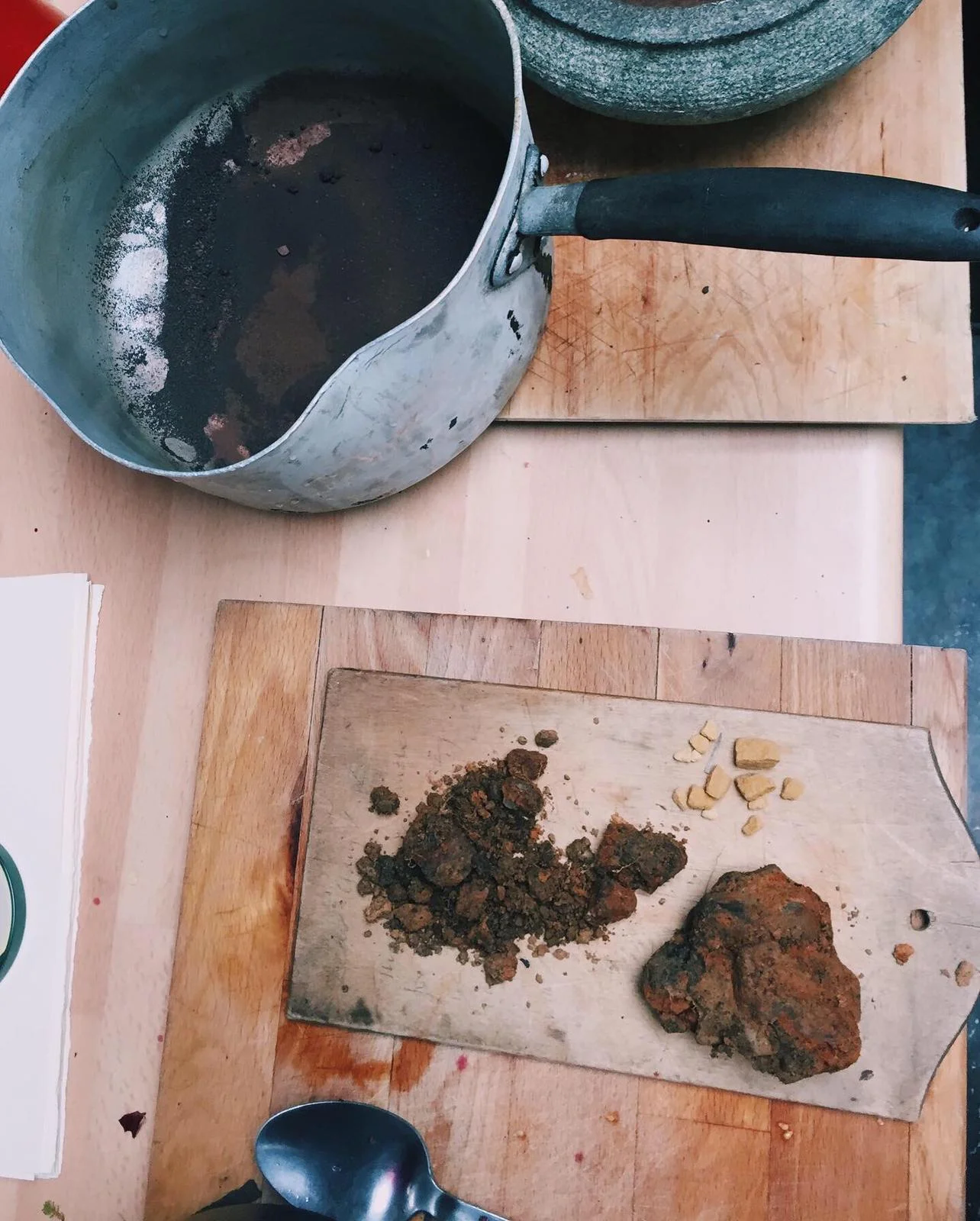
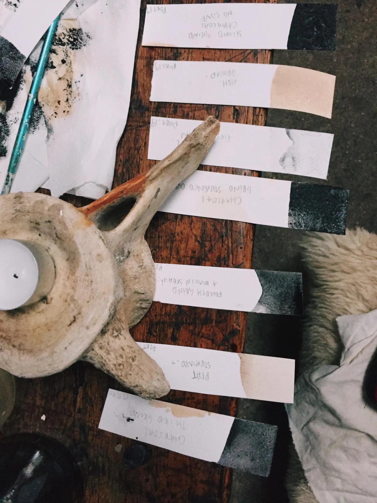

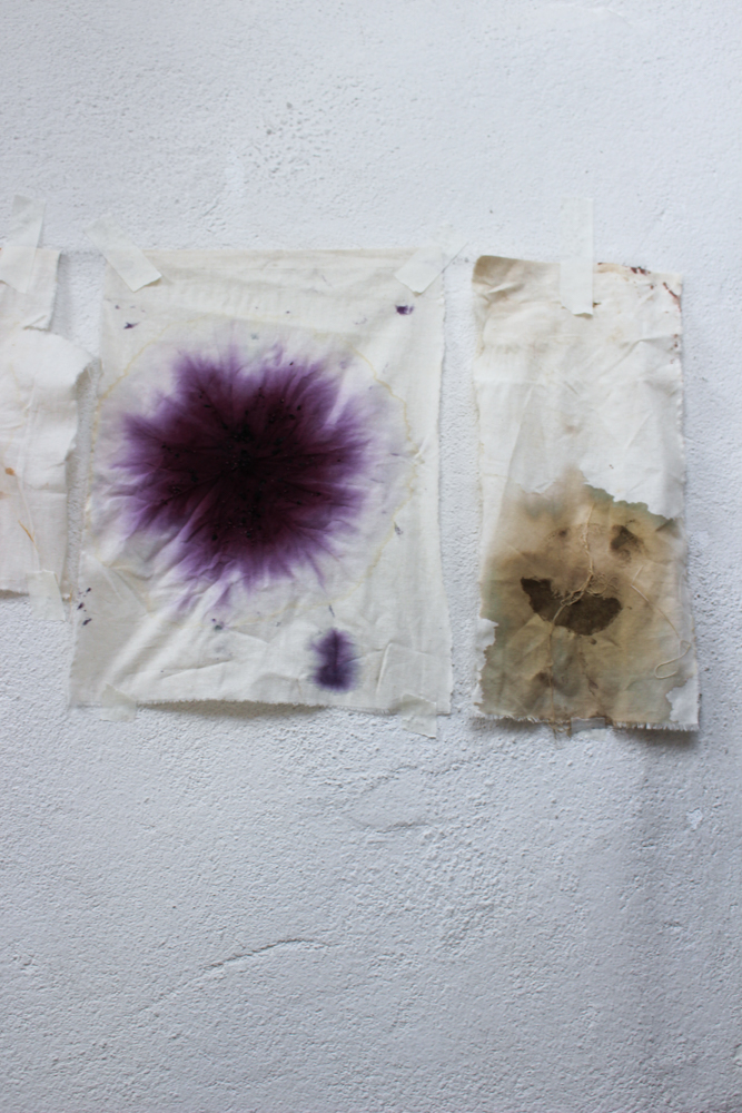
Two hours passed since beginning the first boil. The ingredient was crowberries, foraged from the top of the bog behind the house on the Slieve League Peninsula. The berries, we believe, were those lucky to be missed by flying Chough birds, and the grazing of sheep. The haul was just over a handful but the hue was deep and luscious.

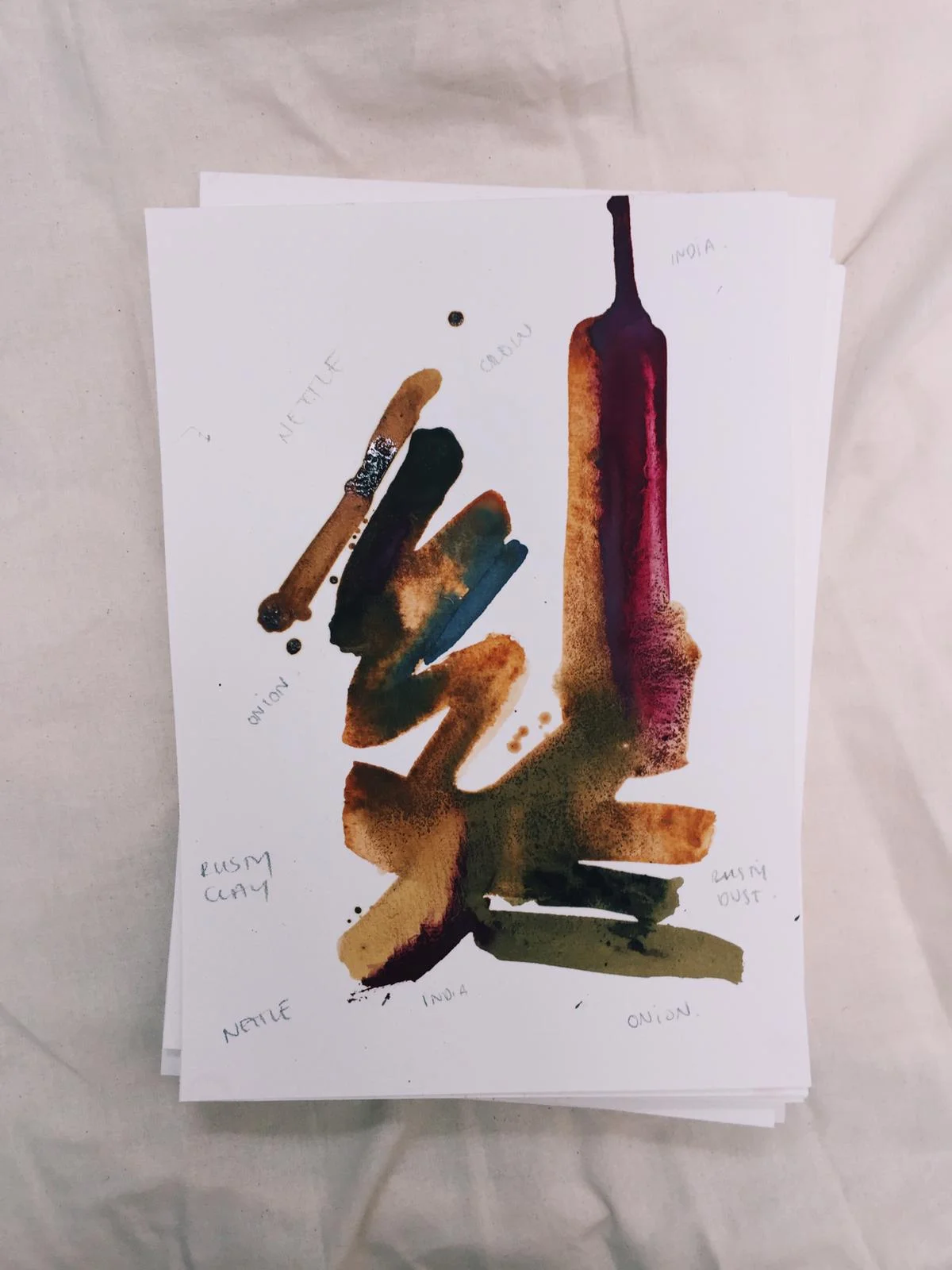
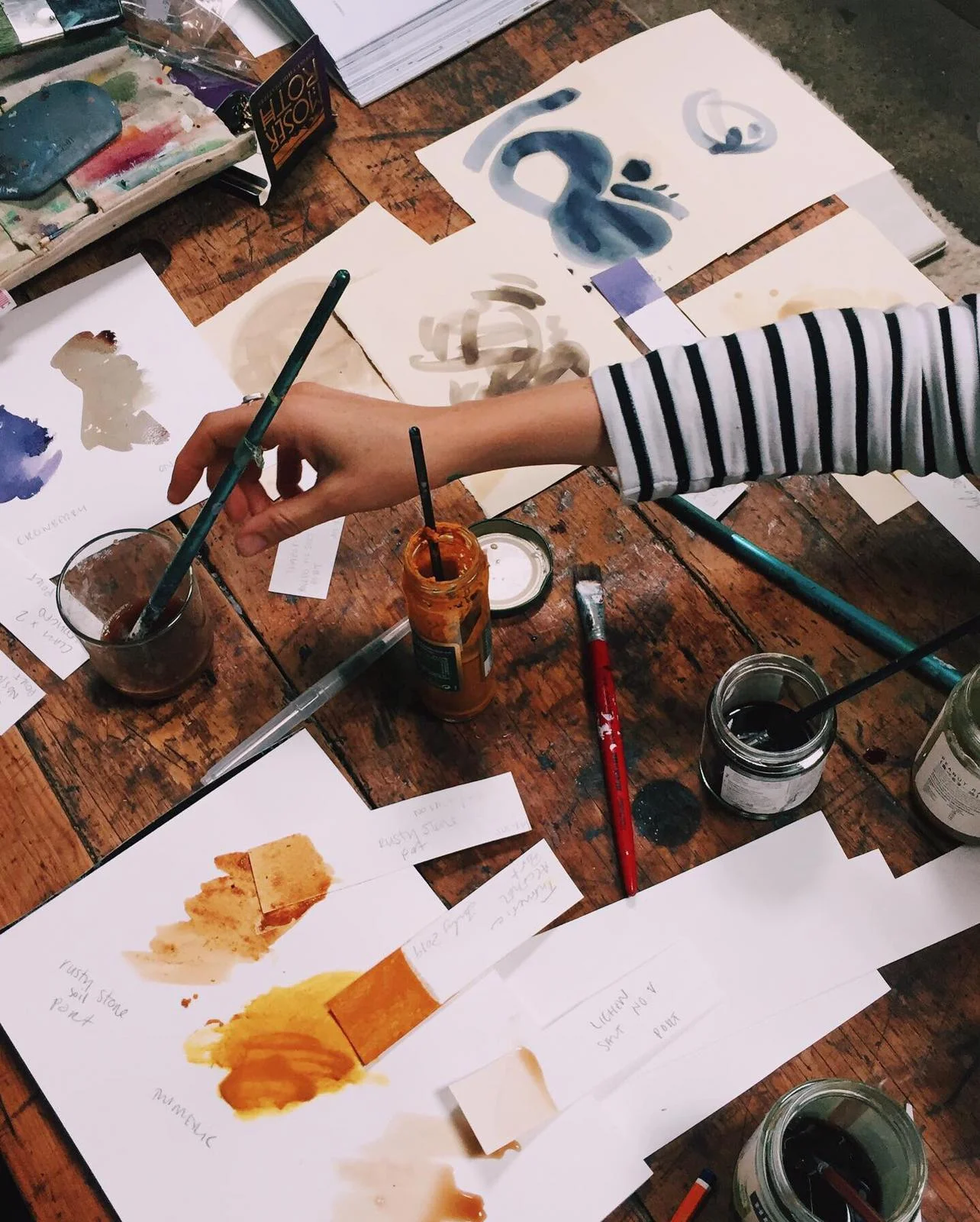
Deep purple in colour, we dipped our brushes in and began teating the ink. The purple ink glistened on the paper and as it began to dry the colour transformed to a steady blue. Nettles, kelp and lichen followed. And over the course of the residency we created blacks from the charcoal, dusty beige from ash, orange from seaweed and pretty much all the variations of brown you can imagine.


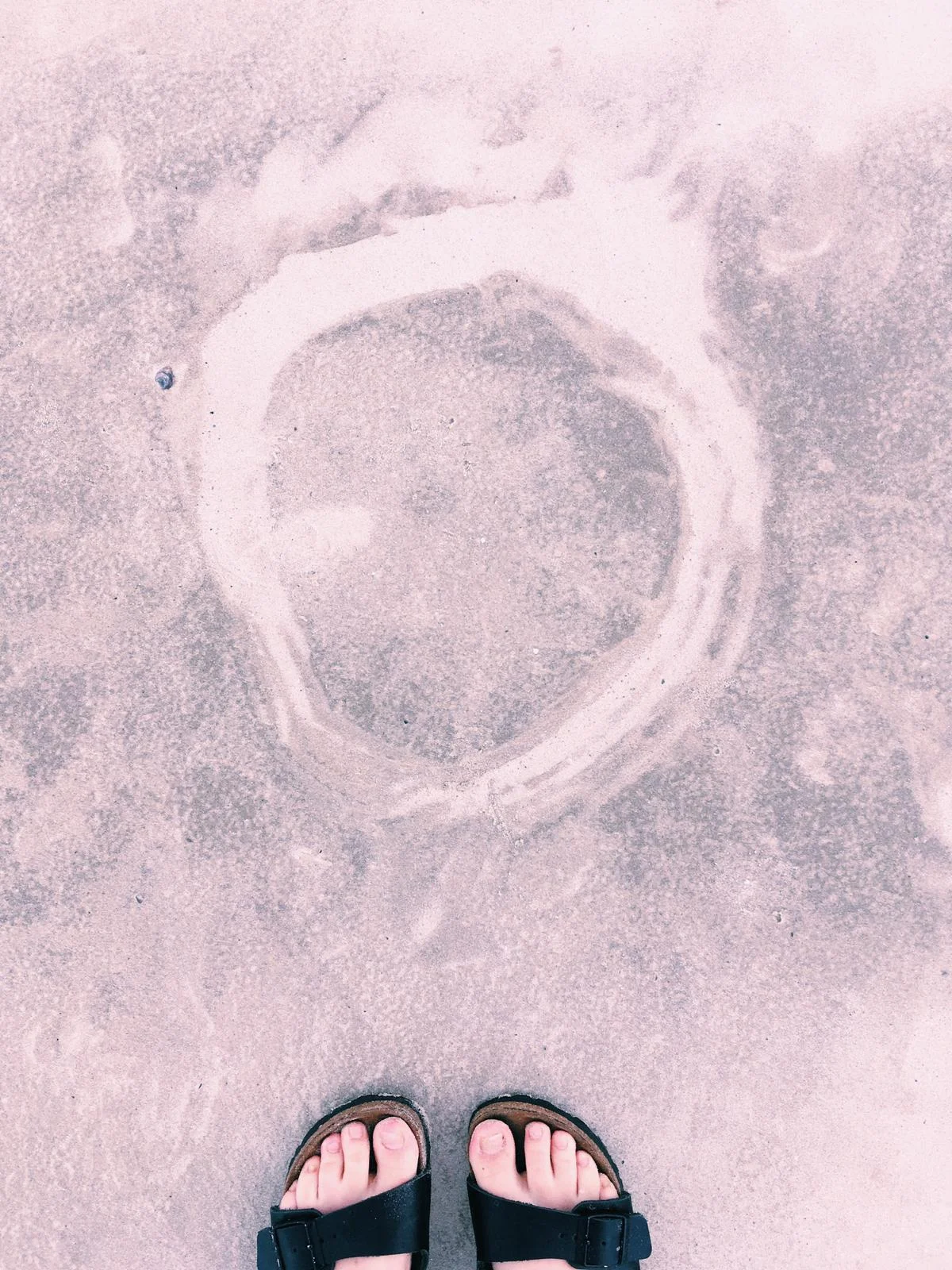
The pink landscapes of Brazil.
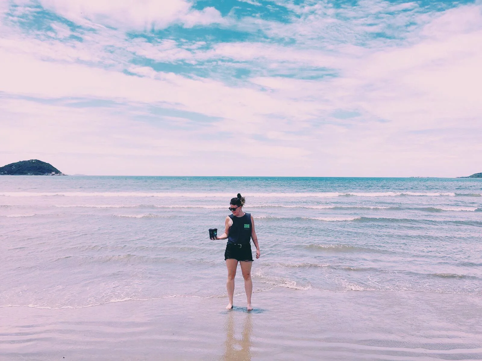
Going into the residency at NaCasa I was determined to paint every day. I wanted to have time and freedom to make work that I was unsure of, or that was outside my comfort zone. I have moments where I question what I do; why the marks are important, why I make certain aesthetic decisions, how far I should push a certain idea. I felt that this residency would allow me to work out some of these questions.
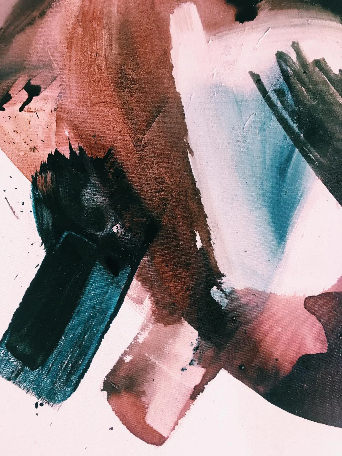
The colours in Brazil are so bright yet there is a haze to the air which causes a dulling effect over the landscape. I was constantly met with pinks and wines and dark marroon shades. The light falls in a sparky way; the sun blocks a lot of my vision, and often I found myself squinting to see the colours behind the light. This process led me to a deeper enquiry, a kind of pairing back in order to really view what was hidden. Light bouncing off a purple creates a bright mint colour for a flash. Sun streaming through trees bounces turquoise against it’s leaves.
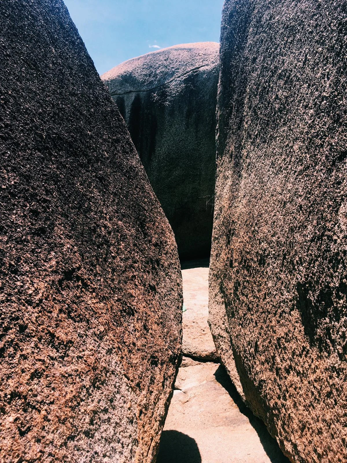
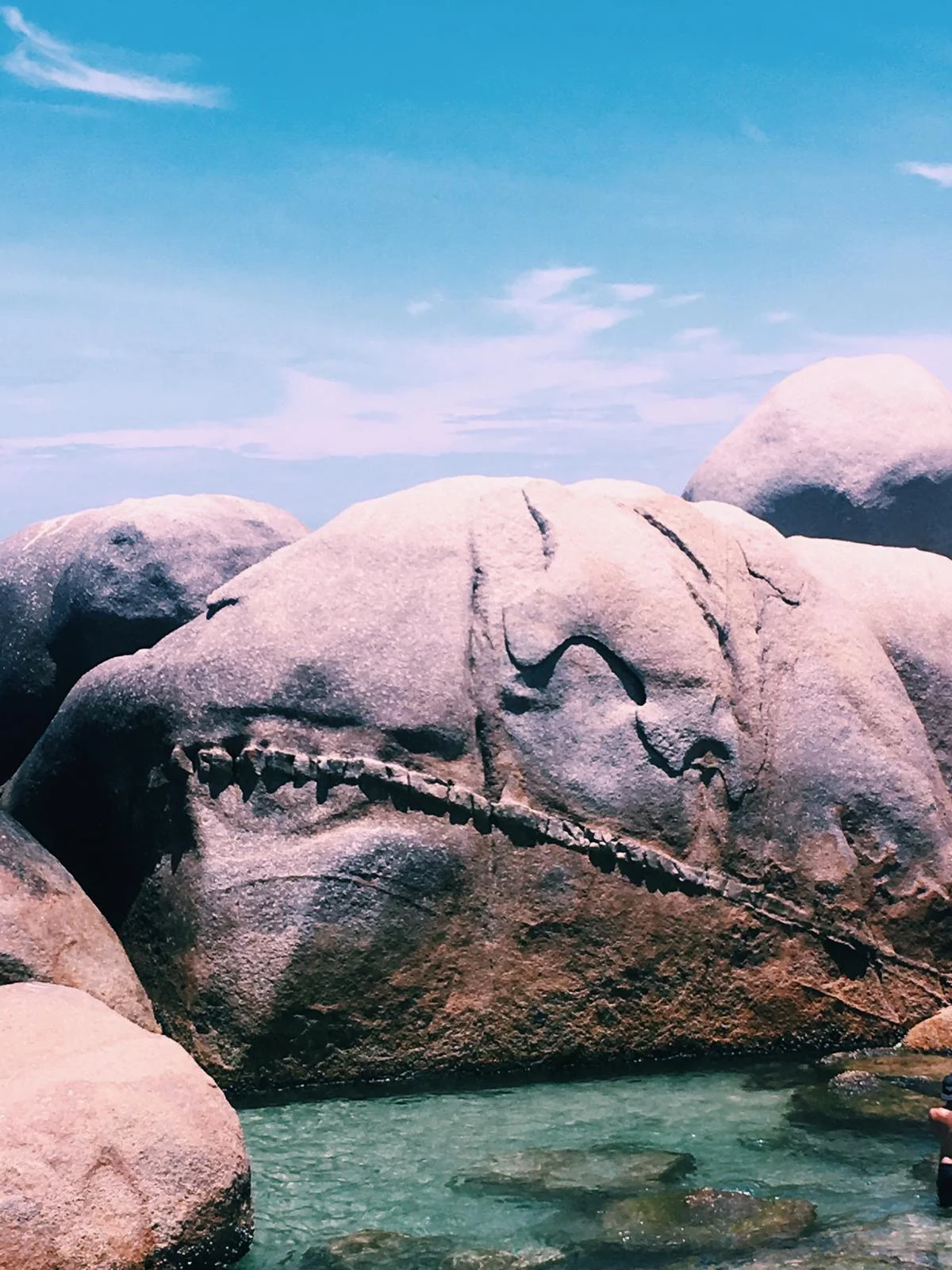
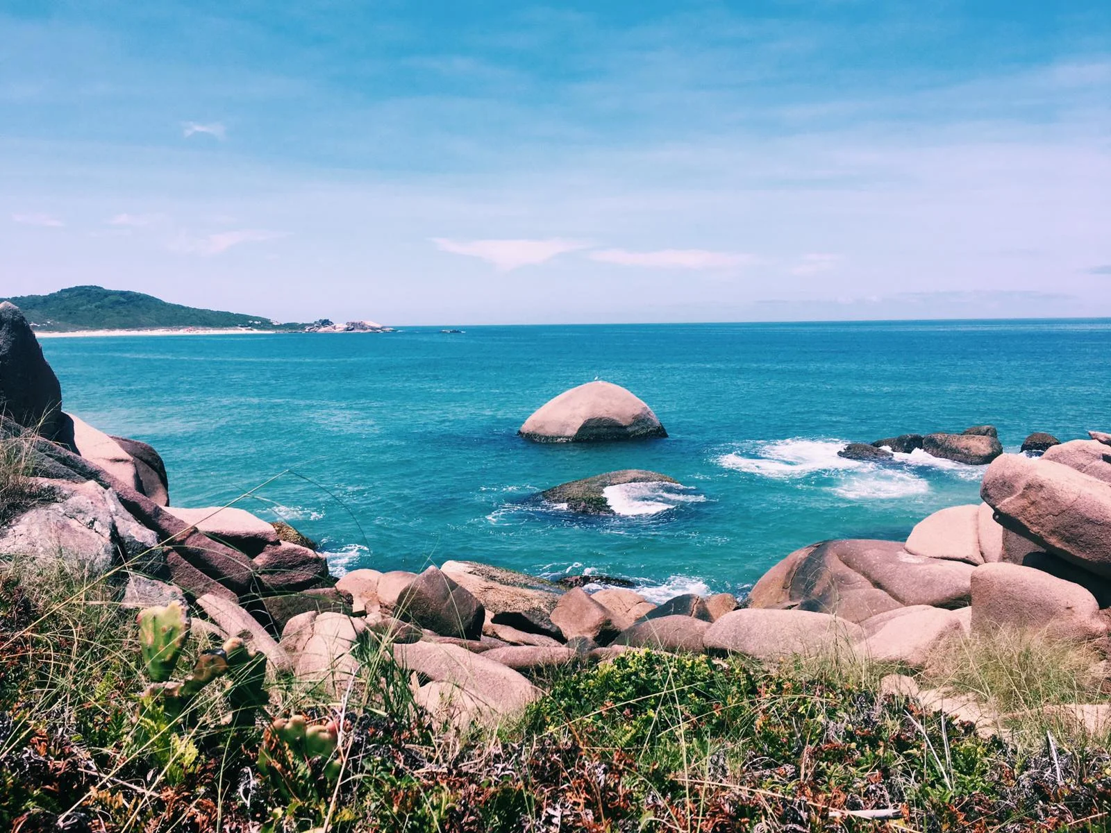
The landscape, although formed from the same ocean as Ireland, has evolved in a less jagged, rugged way. Boulders are soft and pink and fold into themselves, which reflect in rockpools a much lighter shade.
Throughout my residency in Floripa I quickly filled my notebook with strokes of colour. Nogalina became my go to material. When mixed with acrylic pigments and paints the nogalina transforms the colours into deep vibrant hues which seem to dance across the canvas.
Experiments in Light and Colour - From the East Coast of Brazil
I was introduced to a beautiful material while living and working in NaCasa. Diego de los Campos, an Uruguayan artist who works full time at the house showed me how to slowly mix Nogalina into a fine liquid paste. Nogalina is the dried shell of walnuts and is ground into dust. The dust is water soluble and moves in a deliciously smooth way. Mixed with acrylic paint the colour takes on a new life, rolling around the paper like ink, before soaking into the pages.
There is something quite extraordinary yet simple about using colour found in nature.
These are the paintings which came from the experiments with Nogalina while trying to capture the essence of the Florianopolis landscape.
These pieces are all for sale. Please get in touch if you would like to purchase a bit of the Brazilian Coast!


Photos: Fellipe Lopes